Wednesday, October 26, 2011

Use Type Like a Pro—Part 1

One of the fastest ways to make your communications look unprofessional is by poor use of type. Here are three mistakes Jim Godfrey identifies that every pro should avoid:
  1. Two spaces between sentences. Once upon a time, typewriters used a monospaced typeface. Since all of the letters were the same width, it became customary to add an extra space at the end of a sentence to call attention to a new sentence. This was never the practice of professional typesetters, who always used one space. (If you're doubting this, find an old book and see for yourself.) Since most typefaces on our computers vary in width, unsightly gaps appear if two spaces are used--so retrain yourself to use just one space after a sentence.
  2. Failing to kern display type. Nothing bellows "I'm an amateur!" quite like display type that hasn't been properly kerned. Unseemly gaps can impede readability by distracting the reader. The kerning tables of some typefaces are great, but the human eye is divine. Remember that we read shapes--not individual letters--so kern accordingly.
  3. Using a hyphen instead of an en dash. A hyphen is great for a hyphenated word, but an en dash can be used to indicate a range of numbers or a duration of time instead of the word "to": the 8–10 Commandments, not 8-10 Commandments.  
—From "Thou Shalt Not" by Jim Godfrey, published in the July 2011 issue of How magazine.

Wednesday, October 19, 2011

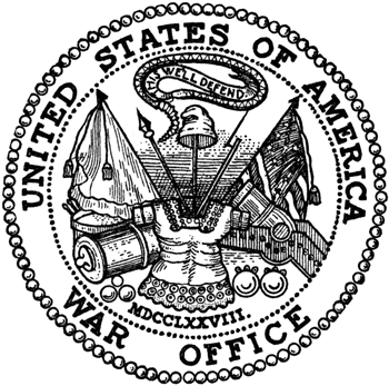
Department of War or Defense: Words Matter


From 1789 until 1947 the department responsible for the operation of the United States Army was called the War Department. In 1947, it was renamed the Department of Defense.

Play along with us on this little turn of words, if you will, and ask yourself which you’d rather support with your tax dollars: a war department? Or a department of defense?

See the different feelings these two names for the same thing evoke? It’s much easier to rally support for defense then war. And so we see yet another example of how much a word matters in evoking a desired response.

What words in your business might need rethinking?

Wednesday, October 12, 2011

Pick Easy-to-Read Typefaces for Body Copy


We read words by shapes—not individual characters—and our reading has a natural rhythm. An alphabet such as Futura Light (below, top) with widely varying character widths disrupts this rhythm—making it harder to read.

When designing printed material, select a body text typeface with similar character widths. Your readers will thank you.  

From Before & After Magazine, What's the Right Typeface for Text

Friday, October 7, 2011

Eight Reasons to Celebrate Your Company’s Anniversaries

CMBell Company was in Los Angeles at White Memorial Medical Center last week to begin work on the planning for their Centennial.
  
A company anniversary provides an opportunity to breathe new life into your organization—to offer a kind of oasis in the press of daily work. A strategically planned anniversary celebration can:
  1. Recognize the people who make your success possible
  2. Deepen bonds with your community, customers and staff
  3. Inspire deeper engagement
  4. Infuse the workplace with meaning
  5. Shift internal focus from problems to achievements
  6. Reinforce your culture, mission and values
  7. Attract positive press
  8. Provide a foundation for casting vision for the future
There’s no rule about which anniversaries you should celebrate. Whether it’s a 15th (ours, next year), a 20th, or a 100th, these occasions provide valuable time for reflection and celebration—both of which yield subtle but important fruits in the work place.

Wednesday, October 5, 2011

2011 Web Trends Part 2

Our last post highlighted some trends in Web design for 2011. We continue that here.

Adventurous Domain Names—The common .com is going out of style. Look for more creative addresses like .me which is becoming more common for blogs or portfolios or .us for business pages.

Quick Response Codes—You may have noticed these appearing on business cards, ads, billboards, etc. This is one trend that has a multitude of uses and doesn't seem to be going away anytime soon. Here are some cool uses for a QR code: 
  1. Put a QR code on the back of your business card so people can easily visit your Web site.
  2. Place a QR code on ads or store fronts so that smartphone users can access special offers, coupons or giveaways.
  3. Use QR codes on T-shirts so you can be a walking promotion for whatever it is you are wanting to promote.
  4. QR codes can also be used to make phone calls or send texts when scanned. Think of all the possibilities with this one!


Thumbnail Design—Thanks to Google's new thumbnail browsing you no longer have to click through to see the contents of a Web site, so expect your site to be judged based on a thumbnail as users become more acquainted with this new way of browsing. This poses a problem for Flash sites because that part of your design will not display in the preview.


Constant Connection / Life Stream—In our quest to make the internet more personable, we have taken to sharing all aspects of our lives online. Expect to see more integrated live feeds on Web sites such as the site below.

Monday, October 3, 2011

Holiday E-Cards Are Environmentally Friendly

Now’s the time to think about your holiday message to your clients. Instead of the traditional, ho-hum preprinted holiday card, do something original, high impact and environmentally friendly—an e-card.

Here are a few examples of work we’ve done in the past:
The holidays are a time to create a breathe in the working world—introducing ideas that speak to deeper issues in the human heart. Use your card to acknowledge your gratitude for your clients’ patronage, convey a mutually held value, or introduce an artful and inspiring message that provides a momentary oasis for the recipient. We promise you, it will be far more impactful and welcome than an impersonal, imprinted card.

Copyright © 2009 CMBell Company, Inc.

Unless otherwise credited, all content copyrighted by CMBell Company.