Monday, January 24, 2011

Printing Tip #3—Fit

Had we not been in this business, we would not have believed the remarkable range of printing estimates one can receive on the same job. The variances are so wide that at times we have to wonder if they are talking about the same job.

Several factors impact pricing, but today we'll talk about fit.

Printers all have their niches. They each have different types of equipment that are suited to various jobs. Putting a small job on a large six-color press simply won’t be competitive, no matter how they sharpen their pencil. You have to know your printer, and know which jobs they are best suited for. This will impact not only your price, but the quality of your printed piece.

Stay tuned for more printing tips.

Thursday, January 20, 2011

The Rhythm of Rest Fuels Your Creativity


World-famous designer Stefan Sagmeister discusses the year-long sabbatical that his New York studio takes every seven years. He thoughtfully distinguishes between a job, a career and a calling, and shows how his time off brings him back to design as a calling. While in Bali for a year, Sagmeister and his team collect enough inspiration and creative to last for the next seven years of work.

Though a year off isn't feasible for most of us, it serves as inspiration, doesn't it? Consider providing a regular rhythm of rest and renewal between periods of work, and see how this impacts your work product—as well as your life.

Monday, January 17, 2011

Client Showcase—Hospitalist Brochure

The concept of hospitalists—hospital-based physicians whose exclusive role is to manage the care of patients who are hospitalized—is still new to many consumers, and many don't understand how a hospitalist might benefit them. To explain this, we developed this piece for the hospitalist program at Avista Adventist Hospital. We paired text that addresses likely consumer concerns with images from both our private stock collection and the hospital to create a custom piece that helps set a patient's expectations about working with a hospitalist—and allay their fears about this new way of delivering inpatient care.

Wednesday, January 12, 2011

What Every Headline Knows

Words all have their jobs. The headline’s job is to get you to read the subhead, and the subhead’s job is to get you to read the copy. Sometimes a caption or bullet list stand in for these.

These are the gatekeepers to the message—so pick them with care, test them on innocent bystanders, and then rewrite them until you’re sure they work. Here's how it works.

Start with a killer headline.

{Like that. See, you want more.}

Make them a promise they can’t refuse.

{Want more?}

OK, I’m going to stop there—I don’t want to spoil the fun by writing the whole story, but I think you get the point. Make those headlines do their job, or send them to headline heaven and spare the reader the yawn—and your client a wasted encounter.

Wednesday, January 5, 2011

Events That Make Sense


We're very cautious about recommending events because of the time they consume (often not calculated in real dollars) and the potential pay-off when compared to other marketing tools.

But here's one example of an event that made sense. Outside shopping malls in Shanghai, China, in-line skaters dressed as prawns, pork, eggs, carrots and fish skated on a giant wok to demonstrate its non-stick surface. After a 20% increase in sales, Supors is looking to take the show on the road.

More and more, we see entertainment themes as underpinnings of successful creative promotion. It would be impossible to miss a show like this if you were a bystander, wouldn't it?

Monday, January 3, 2011

Client Showcase—PSMMC Spine Brochure

This spine brochure was part of a spine campaign for one of our clients, and served as a flexible tool that not only promoted the program but its numerous physicians. To make the piece easily customizable for each physician office, we created a folder in the back to hold a card on each physician. As physicians came and went, these cards could easily be updated without outdating the brochure.

But creating a brochure is just the first step. Give thought to how it will be distributed. We recommended to this client that they mail it to referring physicians with a cover letter, distribute it through the participating physicians' offices, and distribute it to hospital staff, since they serve as sales people.

Thursday, December 30, 2010

There's No Such Thing as Good Writing

Only good rewriting.

One of my college writing professors drilled this into our heads, and I confess it’s one of the few lines I remember from that class. But it has served me well in times of writing—especially when writing ad copy, where the allocated space is so spare. Every word simply must do its job. Every nuance has to be considered. We often have full-on discussions about a single word or phrase.

Did they clamor or bellow? Was it disturbing or agitating? Did he flinch or recoil?  See how each word has a slightly different meaning?

Writing isn’t unlike gardening, for those of you warm to that metaphor. It takes patience, tending, and lots of weeding (sometimes even replanting). It’s also like cooking. It often has to marinate to get the full flavor.

So don’t be discouraged if the first words out aren’t show-stoppers. They rarely are. But they often give birth to the perfect word, given time and effort. And that’s the difference between ordinary writing and great writing.

Thursday, December 23, 2010

A New Year's Prayer

We are grateful to you—our clients and our readers—for inspiring us, teaching us, and exploring the world of ideas with us on our blog.

In the spirit of the season, we offer you this New Year's Prayer for a more compassionate world—and our commitment to strive to do our part in making it such.

We wish each of you the joy of the season, and a new year marked by good health, hope and peace for you and yours.

Wednesday, December 22, 2010

Give a Priceless Gift for Christmas

Sometimes the best gifts can't be wrapped. This season, consider these priceless gifts:

To your enemy, forgiveness.
To an opponent, tolerance.
To a friend, your heart.
To a customer, service.
To all, charity.
To every child, a good example.
To yourself, respect.
—Oren Arnold

Image Source

Monday, December 20, 2010

Client Showcase—An E-card That Makes a Statement

A simple way to distinguish your company is to say farewell to those tedious pre-printed holiday cards and create something customized.This is the time for the little black dress, not the standard pantsuit, if you want people to see your firm as innovative and successful.

The law firm of Gresham Savage hired us to develop their annual holiday e-card, which gave us a great opportunity to tie their centennial year messages in to their holiday message.

While an e-card isn't the place for overt selling, it definitely leaves an impression about your company. In this case, we wanted to link the history of the firm to the history of the community—deepening their bonds and thanking the community for their role in this milestone.

People like to be thanked, and the holidays are a perfect time to not only do this, but create a classy, distinctive piece for your firm that sets it apart. Plan now to make an e-card part of your company's social media strategy next year.

Friday, December 17, 2010

Who's to say what's impossible?


“If we worked on the assumption that what is accepted as true really is true, then there would be little hope for advancing.” —Orville Wright

Today we commemorate the first successful flights near Kitty Hawk, North Carolina, in a heavier-than-air, mechanically propelled airplane that was made by Orville and Wilbur Wright on December 17, 1903. May all your dreams find wings.

Monday, December 13, 2010

Client Showcase—Emergency Department Brochure


We refreshed the look of these brochures for the emergency department at Avista Adventist Hospital. On a budget, we used existing copy and redesigned the piece to conform with their newer corporate graphic standars.

Friday, December 10, 2010

Advertising Savvy—Avoid Visual Clutter

“Before leaving the house, a lady should stop, look in the mirror, and remove one piece of jewelry.” —Coco Chanel

The single most common mistake in visual advertising is clutter, and when it comes to advertising, less is more. If there are aspects of your design that aren't absolutely essential to delivering the message, get rid of them. Chaotic, overworked ads will never be read.

This ad for children's martial arts classes is a visual assault that tries to incorporate a patterned background, photographs of children, numerous type fonts, building block illustrations, a headline, bullet list, call to action, company name, phone number and url.

Now compare that to this simple, benefit-driven message done by Banda, Bulgaria. It features only a simple background and illustration, a three-word headline and the company logo.

Tuesday, December 7, 2010

What do your colors say about you?

Do you want to convey power? Innovation? Leadership? Success? Whatever your message, color will contribute to the impression. Color—Messages and Meanings, is a great book from Pantone’s color resource collection that can inform your choices. A lovely little book filled with colors, color combinations, moods, visuals, designs and ideas, it sparks reactions, starts dialogue, and fuels creativity. Get your copy here.

Wednesday, December 1, 2010

Client Showcase—Hawaii's Largest Health Plan Takes its Story to the People


When HMSA, Hawaii’s largest provider of health care coverage, contacted CMBell Company, they were looking to create an attitude shift regarding their innovative new health care initiatives. We work with them to develop a Power Point presentation that would be delivered at public forums by their capable senior vice president.

To paint the vision for their initiative, we created a fictional character and walked her through the present—and proposed—health system to bring their plan to life. The presentation, they report, has been effective both in terms of getting their message out to the business community and in influencing their intended providers.

The successful combination of a compelling story, presented in person by a credible speaker, can sometimes yield big results for a company. For some situations, nothing compares to face-to-face communication.

Tuesday, November 30, 2010

Client Showcase—A Direct Mail Piece That Won't Be Ignored


For their 100 year anniversary, the law firm of Gresham Savage wanted a direct mail piece for community leaders, clients and prospective clients that would make an unforgettable statement about their firm’s legacy. For this, we worked with them to create a handsome gift box that paired a brochure with a Gresham Savage pen and five custom-developed note cards that featured historical images of their community.

This allowed us to not only tell their story but to acknowledge the role their community has played in reaching this milestone. The vintage note cards showcase local sites and leave the recipient with a handsome collection of cards and envelopes to use as they see fit. It isn’t often that a direct mail piece delivers something of value to the recipient, but when it does, you can guarantee a higher level of impact.

Thursday, November 25, 2010

Thanks-Living

"As we express our gratitude, we must never forget that the highest appreciation is not to utter words, but to live by them." —John F. Kennedy

We wish all of our followers, friends and clients a gratitude-filled Thanksgiving. What are you thankful for today?

Image source

Monday, November 22, 2010

Beware the Nasty Mug Shot in Your Ads


Think you're saving money by using a photo in your ad that was taken by your personnel department—or someone else in the organization who fancies himself a photographer? We'd suggest you can the ad altogether if you can't produce a good, professional-quality picture.

Whenever you're promoting a professional service, a strong photo of the right kind is imperative. We've seen too many similar ads where the  photo looks like a passport photo or police mug shot—conveying him or her as lifeless, unengaged, unprofessional and even incompetent.

By contrast, the images used in these two ads capture the vibrancy and personality of these physicians. They invite you to trust them with your health, and are warm without being overly chummy.

When we work with health care clients, we insist that physicians wear uniforms or lab coats—sometimes to great resistance. In the same way the public expects a police officer, military personnel or airline captains to be in uniform, they still want to see evidence of this professionalism in the apparel worn by health care providers. If you're inclined to disagree, ask yourself how you'd feel boarding an airplane with staff wearing jeans and polo shorts—or worse yet, t-shirts.

Thursday, November 18, 2010

You Can Be Indispensible


Ever notice how easy it is for all of us to see all that is wrong with the world? Anyone can point out problems, but it's the one who brings solutions to their organizations that stands out.

You will be surprised how quickly you can distinguish yourself by observing this one simple rule. By seeing and addressing the strategic issues that impact the success and future of the organization, you can establish yourself as a visionary, a leader and a valuable member of the team.

More often than not this requires more persistence and positive attitude than it does brilliance. As Albert Einstein once said, "It's not that I'm so smart, it's just that I stay with problems longer."

Monday, November 15, 2010

Good Ad/Bad Ad—Don't Make Your Reader Work Too Hard

Ads that work don't make consumers work hard to get their point. If it takes more than a second or two to figure out, most of us will move on unless we're highly engaged in the topic.
Even if you can't afford a formal research project, you can test for this by running your ad by people (more than one) who know nothing about the topic. Make them do a walk-by and ask them what the ad is for, whether they remember the name, and what they could do if they wanted to buy the product or service (is a call to action evident).

Here are two examples of a similar message—one that's effective, and one that isn't. The first billboard:
1. Is too busy—impossible to read it all while flying down the freeway—so some key messages will be lost.
2. Doesn't immediately telegraph the problem that I can relate to—a need to lose weight.
3. Buries the potentially relevant "judgment free zone" message in fussy, small type.
In the example below, by The Johnson Group, the message is both simple and clear. Most of us can relate to the bulge, and the tipped angle of the board cleverly reinforces the overweight message. A URL might have been a nice addition, if it were available—but fortunately, the fitness center's name is dominant enough to remember—and to search for online later, when one has the chance.

Friday, November 12, 2010

Social Media—Can we make it easy, please?


Like most everyone else in this field, I’m still observing, analyzing and sorting through the ideas I read about how to use social media effectively.

One truth seems to be emerging, however. Social media is about creating relationships—not “talking to” or “talking at.” And there are no quick fixes for doing this.

Just like creating face-to-face relationships, these virtual relationships are built over time as two parties assess one another and decide if there’s a match. There’s no value in doing the peacock act—trying to look bigger or better than you are—because ultimately people get to the truth about us or our businesses by observing what we do—not just what we say. It calls us to pay as much attention to who we are becoming as people or as organizations as it does to crafting a message. And that's a tall order.

So the answer to my question—can we make social media easy—is no. We can’t. It’s even less about fluff and posturing and self-promotion than the more traditional forms of advertising or communication, because it opens the conversation up to the crowd, who is now able to collectively pool their observations about our company or product. And it's more like one-on-one relationship, that demands more than sanitized PR messages—and wants something of value.

There is no substitute for substance. Care about your work, your clients or customers, and then talk with and listen to them. Social media is a great tool—but it is only that, the tool. It is not the message, nor is it the deliverables. But it holds great promise for a new kind of truer, two-sided relationships and evaluation of our products and services. And I like that.

Image Source

Thursday, November 11, 2010

Freedom Isn't Free

I recently came back from visiting Washington, DC, where I spent some time at Arlington Cemetery.  One cannot visit this sacred place without a renewed sense of the great price of freedom.

As I stood quietly overlooking that sea of graves, I had an even deeper sense of gratitude for the great sacrifice made by those who have given their lives for this country--as well as those who are presently in active service and in harms way.

I invite you to join CMBell Company in saluting our veterans not just on Veterans Day, but every day. May we live in a way honors their service.

Thursday, November 4, 2010

Reaching the 18- to 29-Year-Old


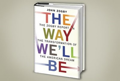
In John Zogby's fascinating book, The Way We'll Be, he offers insights into how 18- to 29-year-olds think:
  • They care about more than just themselves—contrary to how they've been depicted
  • They celebrate diversity—and expect marketers to realize that
  • They think and buy globally, and travel extensively
  • Just about everything in their lives is public, and they're far more comfortable with this lack of privacy than their parents
  • Their space is the Internet—and they're easily accessible through social media
Whatever your business, you'll likely need to be talking with (not to) this demographic. Zogby helps start the interesting and relevant conversation about how best to engage them.

Source: The Way We'll Be, John Zogby. Buy it here.

Monday, November 1, 2010

Color Psychology—The Facts About Black

"Black is beautiful." —Huey Newton

Black will always have a presence, not only in the world of fashion, but in all design disciplines. Adding black to a color or design adds impact, depth, weight, substance and even subtlety.
Black wields a strong presence and is perceived as powerful, stylish, contained, modern and yet classic.

Of course, black is often an accent color that takes on variations in meaning based on the color with which it is paired. As you choose black in your design, consider the moods it conveys: power, elegance, sophistication, boldness, mystery, strength, luxury, magic, darkness, seriousness or prestige.

Use black whenever you want to convey these attributes, but remember that quantity and context can influence the overall impact.

Source

Copyright © 2009 CMBell Company, Inc.

Unless otherwise credited, all content copyrighted by CMBell Company.